Australian Parents Council.


Identity, Brand Logo & a corporate logo for a legacy non profit organisation based out of Australia, helping parents empowering their kids to thrive in school...since 1962.


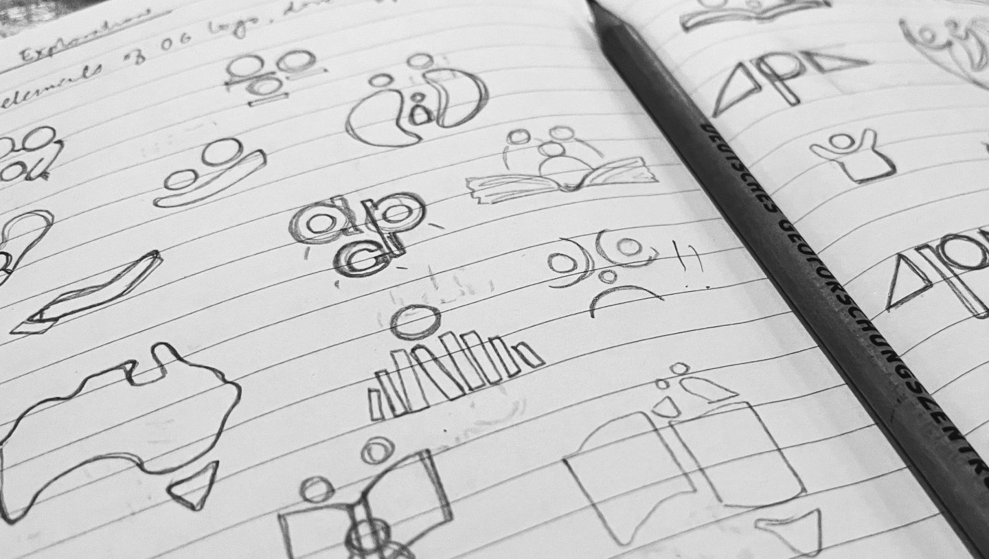
The Primary Logo Mark consists of three main elements: The Map to signify Australia, the Parent & Child symbol and the Stars to signify the achievements that the APC is supporting the children to work towards.


All of these elements come together to signify the core values of the APC that include empowering parents and shaping effective education policies to foster the academic, social, and emotional success of students in non-government schools.“

Being a non-profit organisation and having it’s operations deeply integrated with the government into improving private schooling and associated policies, it was an imperative decision to ensure that the logo had to reflect the Australian Continent, it’s flag and it’s values. Hence all elements have been designed and arranged in a manner that helps reflect APC’s core values.


For their corporate website, a highly adaptable and scalable design and information structure was proposed to ensure that the website and it’s content buckets can accommodate both new and legacy content which has been hosted on the site since years, while ensuring ease of use, high degree of discoverability and a clean user experience.


The goal of our identity refresh was to ensure that APC gets itself to remain contemporary and young but still position itself as a strong legacy driven foundation with robust values and a strong voice for it’s representative stakeholders.

 
Next
Next

Alteria Capital