Identity, brand and communication design for a food forward, unique brunch & supper experience space started in Goa in 2025.
“
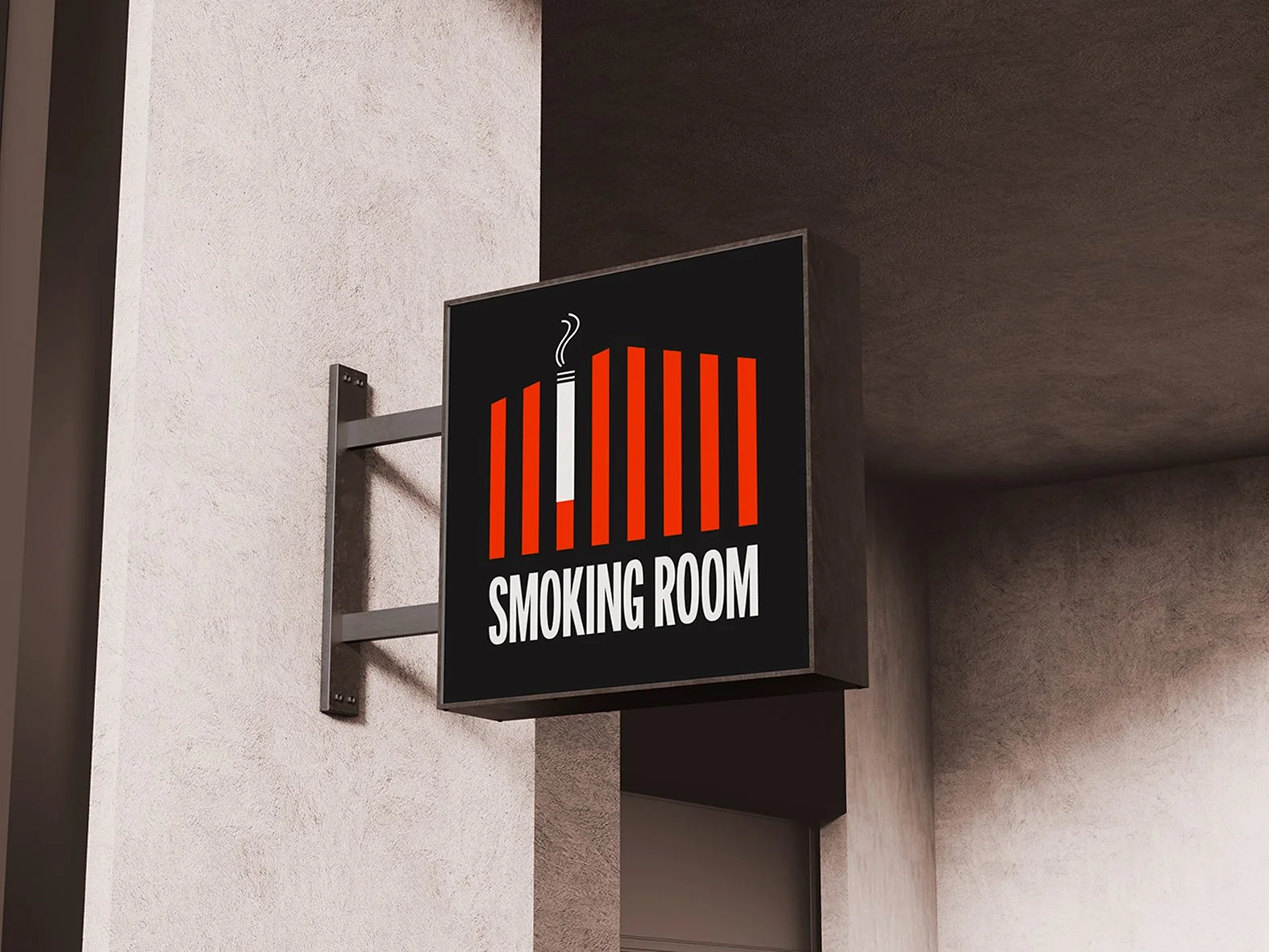
"Forget cluttered logos and tired traditions. The Foundry's mark is a primal scream of minimalist brilliance, forged from the very structure that defines it. We've stripped back the noise, leaving only the essential – a visual language that's both timeless and utterly of-the-moment. And then, Fire. That orange. It's not just a color, it's a statement. It's the beating heart of The Foundry's brand."
“
“
Our approach was to fuse the traditional and the contemporary. Since that was going to be the central philosophy of the menu design, we felt retro and modern should find it’s way together on all communication assets helping weave a spectrum of cultures.
“
“
The Foundry's identity seamlessly integrates its core values. The bold, sans-serif typography reflects the Innovation driving the space, while the vibrant "Fire" orange symbolizes the Passion that fuels the culinary creations. The open kitchen, a central feature, embodies Collaboration and Transparency, showcasing the teamwork and dedication behind the dishes. Every detail, from the carefully sourced ingredients to the meticulously crafted presentation, exemplifies the Quality and Integrity that define the Foundry experience.